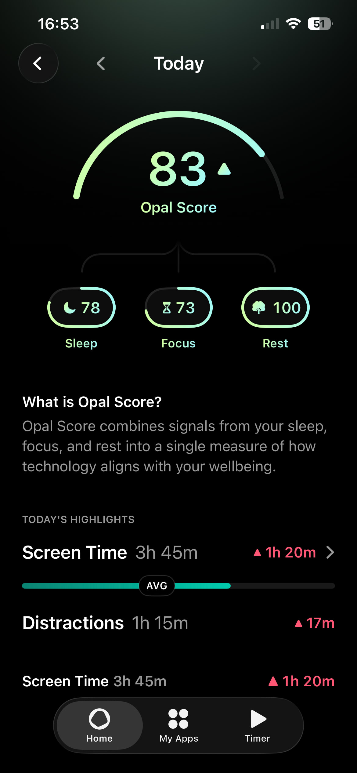
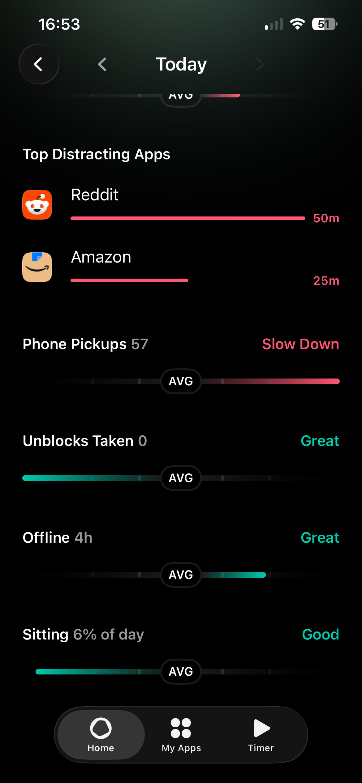
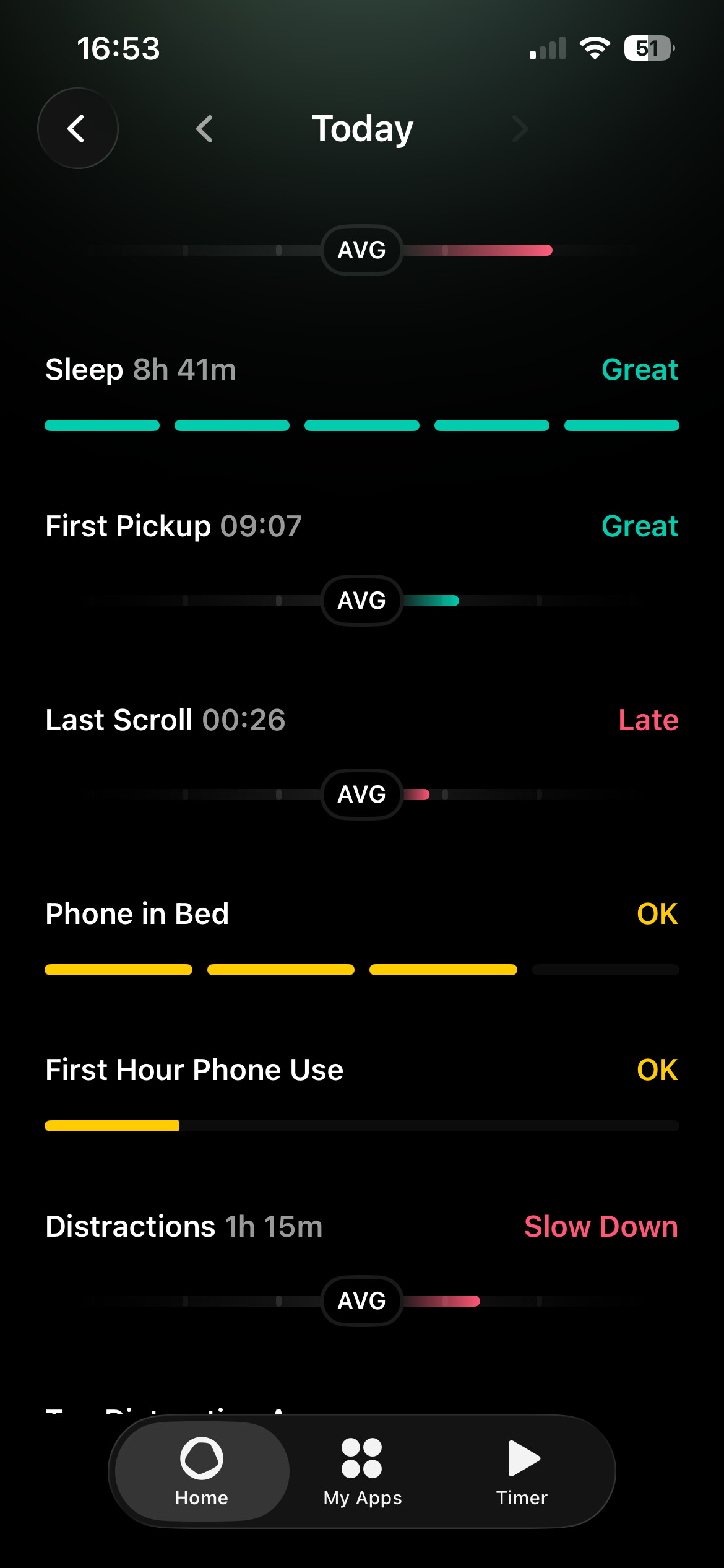
The Opal score is a cool concept, and I’m open to it, but it does leave me with more questions than answers. I think it would be really valuable to have information about certain “Opal” things.
- Phone in Bed: I’m assuming this means how often a user uses their phone in bed, but it is never explained to the user how this is being determined. This could be accessible to the user in a tooltip if Opal is worried about taking up screen real estate (I’m a web dev, idk what a tooltip is called for mobile). The score is also listed as “Ok” but the user is never told a) what all possible scores are and b) what “Ok” even means. Does “Ok” mean that I’ve spent 3+ hours on my phone in bed? What do I need to do to attain a better score going forward? It would be really valuable here to give users information on what the score means, and what they can do in the future to attain a better score.
- First hour phone use: Again, what does this mean? I think all of the feedback from my previous list item could be applied here. It would be useful for the user to explain how this score is measured and what the user can do in the future to attain a better score.
- Sitting: it would be useful to the user to know how this is being determined.
- In general, there are many categories listed as “avg” with different color bars and bars of different length. How can these all be average but visually look so different from each other? It would be useful to explain to the user what average means - is it average compared to their previous data? compared to their friends data? compared to Opal’s user base data? Compared to what “ideal” measurements should be for all users? As for scores, it would be useful to explain what the scores mean and what actions users can take to improve.
- In sleep, phone in bed, and first hour on phone, there’s a different visual for this. It’s like a line broken up into multiple parts. Why is this different than the other visuals on the screen? I’m sure there is a reason, but it’s not apparent to me as a user. In my screenshot, phone in bed and first hour phone use are both yellow and listed as “OK”, but they’re different lengths. Why? What does this mean?
- First pickup and Last scroll: if you have this information available, it would be great to tell the user which app they picked up first/last. It would also be great to tell users how long they spent in those sessions. This could be useful for users that are looking to identify habits to break.
- Screen time is listed twice with one being a green bar and the other being a red bar. What is the difference between the 2? It would be useful to explain this to the user.
In general, I think this screen could be really useful. But right now, the way the information is being presented is confusing and not very useful.